What Is UI/UX? The Difference, the Roles and the Business Impact
What is UI/UX? Learn the difference between UI and UX, how design work runs, and see with a worked example how one UX change moves orders.
 By Aditya S November 4, 2026 Updated November 11, 2026 10 min read

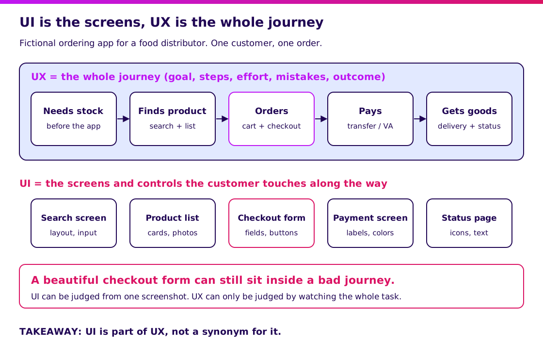
What is UI/UX? UI (user interface) is what a person sees and touches in your product: screens, buttons, text and colors. UX (user experience) is whether that person can finish what they came to do, with how much effort and with what outcome. UI is part of UX, not another word for it.
I’m Aditya S, Business Development Manager at Synetica, a tech-based business consultancy combining strategy and execution for Dreamers and Growing Businesses. This guide explains UI/UX through a fictional ordering app whose numbers you can check line by line. The figures are teaching assumptions, not Synetica client results or industry benchmarks.
You’ll learn how UI and UX differ, why the difference changes what you pay for, how a sensible design process runs, which roles do what, and what mistakes make design spend disappear.
TL;DR — the whole guide in five lines
- UI is the surface, UX is the journey: a good-looking screen inside a confusing flow still loses customers.
- UX problems are usually flow problems: in our example, removing one forced step lifts orders from 192 to 288 per 1,000 starters.
- Test before you polish: grey-box wireframes tried by five real users are the cheapest place to find a wrong flow.
- Hire for the problem you have: a conversion problem needs UX; an inconsistent look needs UI.
- Ask to see the evidence: a designer who cannot show what they changed after watching users is decorating.
What is UI/UX, and how do UI and UX differ?
UI is the visible layer of a product; UX is the quality of the whole experience of using it. The Nielsen Norman Group, a long-standing UX research firm, frames user experience as every aspect of a person’s interaction with a company, its services and its products. A screen is only one piece of that.
Think of a restaurant. The plates, menu typography and lighting are UI. UX is whether you were seated quickly, understood the menu, received the right dish and could pay without chasing someone. A beautiful dining room with a 50-minute wait is a UX failure.
| Term | What it covers | Typical question | Example |
|---|---|---|---|
| UI (user interface) | Screens, components, type, color, spacing | “Is this clear and consistent?” | A checkout form with labeled fields |
| UX (user experience) | The whole task: steps, effort, errors, outcome | “Can they finish, and how hard is it?” | Ordering without creating an account |
| Product design | UX and UI plus what the product should do at all | “Should this feature exist?” | Dropping a rarely used feature |
| Graphic design | Visual assets such as logos and posters | “Does this look on-brand?” | A campaign banner |
| Front-end development | Building the interface in working code | “Does it work on every device?” | The checkout page running on a cheap phone |
Many job ads say “UI/UX designer” because small teams ask one person to cover both. That is practical, but it can hide which problem you are actually paying to solve.
Decide what to test before you design screens with our MVP guide.
Why does UI/UX matter for your business?
UI/UX matters because every unclear step is a place where a customer can quietly leave. You rarely see it happen. You only see fewer orders, more support messages or a team that avoids the new tool.
Consider a fictional ordering app for a food distributor. For every 1,000 customers who start an order, 800 pick a product, 640 reach the cart, and then the app asks them to create an account. Only half of them, 320, continue. After address and payment, 192 place an order.
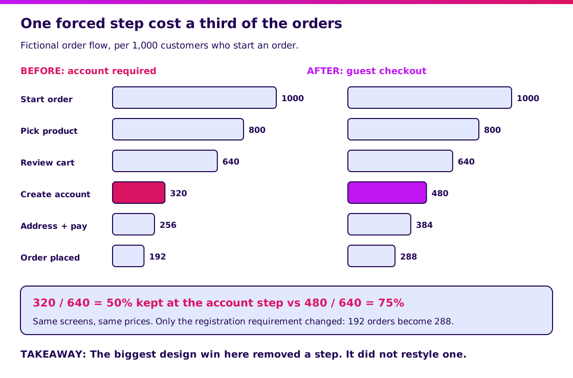
Now assume the team adds guest checkout, and 75% of cart-stage customers continue instead of 50%. The numbers become 640 × 75% = 480, then 384 after address and payment (an assumed 80% keep), then 288 orders (an assumed 75% keep). That is 96 extra orders per 1,000 starters, or 1.5 times as many.
If the average order is IDR 450,000, 96 extra orders is IDR 43,200,000 per 1,000 starters. The example is invented and ignores the cost of building guest checkout, so treat it as a way to reason, not a forecast.
Notice what changed: a requirement, not a color. Open the funnel diagram at full size. If you cannot say where your own customers drop off, you are guessing about UX.
How does UI/UX design work in practice?
Good design work moves from cheap, reversible decisions to expensive ones. Colors come late, because the flow decides whether the colors matter.
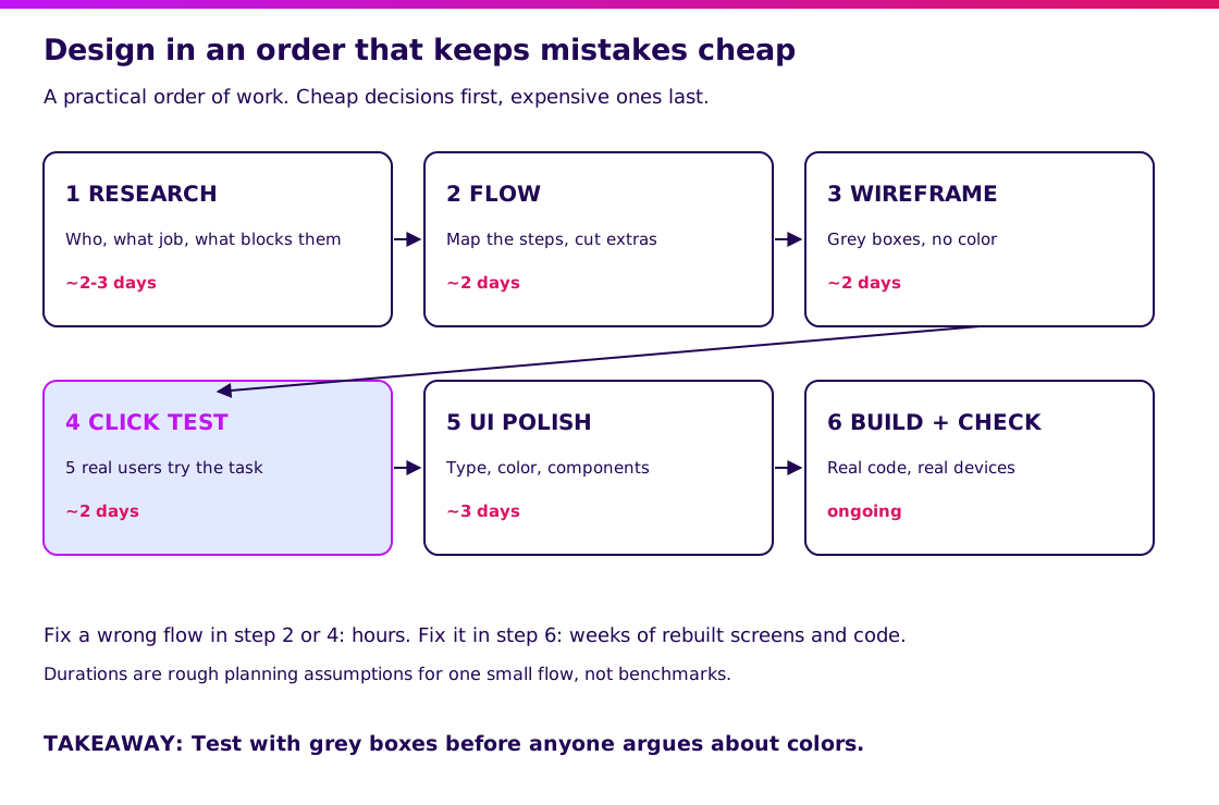
- Research: find out who the users are, what job they are trying to do and what blocks them. Five to eight short conversations are often enough to spot the biggest patterns.
- Flow: map the steps from goal to outcome and remove anything that does not serve the goal.
- Wireframe: sketch screens in grey boxes so people argue about the flow, not the palette.
- Click test: ask about five real users to complete one task on a clickable prototype and watch where they hesitate.
- UI polish: apply type, color and components to a flow that has already survived contact with users.
- Build and check: implement in real code and test on the devices your customers actually own.
In the ordering example, the click test in step 4 is where someone says “why do I need an account just to buy rice?” That comment costs a few hours. Hearing the same thing after launch costs weeks of rebuilt screens and code.
Open the process diagram at full size. The durations are rough planning assumptions for one small flow, not benchmarks.
What are the parts of UI/UX, and who does what?
UI/UX work splits into research, structure, visual design and validation, and one person may cover several. Knowing the parts helps you brief a freelancer or a vendor precisely.
| Component | What it produces | Who usually owns it | Question it answers |
|---|---|---|---|
| User research | Interview notes, task list, pain points | UX researcher or designer | Who is this for and what blocks them? |
| Information architecture | Page map, navigation, labels | UX designer | Can people find things? |
| Interaction design | Flows, states, error handling | UX designer | What happens when they click, fail or wait? |
| Visual design | Type, color, spacing, icons | UI designer | Does it look clear and consistent? |
| Design system | Reusable components and rules | UI designer with developers | Will screen 40 match screen 1? |
| Usability testing | Observed task success and notes | UX designer or researcher | Did it actually work for someone new? |
For a first product, one designer who can do research, flow and UI is enough. For a larger system with many screens, a shared design system saves rework because developers reuse components rather than rebuilding them.
Check how a vendor staffs design work in our software house guide.
What does good UI/UX look like in a real project?
Good UX is recognizable by evidence, not by how modern the screens look. Use the ordering example to see what you should be able to inspect at three points.
| Point | What you should be able to see | What it proves |
|---|---|---|
| Before design | Three to five user interviews summarized, one task chosen | The team knows the job to be done |
| Before polish | A clickable grey prototype and notes from watching five people | The flow was tested, not assumed |
| Before launch | A list of changes made because of those sessions | Feedback actually changed the design |
This is a generic illustration, not a Synetica client result. If a vendor shows you only finished screens, ask what changed after testing. “Nothing” usually means nothing was tested.
Validate it in 2 weeks. Blueprint & Prototype puts a clickable prototype in front of real users and turns what you learn into agreed scope and a cost estimate. The two-week promise covers prototype validation; it does not guarantee a production launch.
At Synetica, Blueprint & Prototype takes 2 weeks, Production Grade Software takes 8 weeks, and Launch & Grow runs as an ongoing monthly retainer. Design decisions are made and tested in the prototype stage, so the build starts from tested flows.
See how the 8-week build uses the validated design.
What mistakes do teams make with UI/UX?
The most common mistake is treating design as decoration applied at the end. By then the flow is fixed and only the surface can change.
- Judging by taste. “I don’t like blue” is not evidence. Ask whether five users completed the task.
- Skipping research because “we know our customers.” You know their orders, not why they abandoned the cart.
- Designing every screen before testing one. Test the riskiest flow first.
- Copying a competitor’s layout. Their users, constraints and data differ from yours.
- Adding features instead of removing steps. More options often mean more places to get lost.
- Ignoring real devices. A design checked only on a large monitor can fail on a mid-range phone with a slow connection.
- Treating launch as the end. Watch where users drop off and iterate. Agree in advance when to change course or stop.
Accessibility belongs here too. Readable contrast, tappable targets and clear error messages help everyone, and they are cheaper to include early than to retrofit.
What would I tell a founder deciding where to spend on design?
Spend on the flow that earns or loses money before you spend on polish. Pick one task, such as ordering, booking or paying, and watch five people attempt it.
For a Growing Business replacing a manual process, involve the staff who will use the tool daily; they will find the awkward steps within minutes. For a Dreamer testing a new idea, a clickable prototype is usually enough to learn whether the idea makes sense, long before final visuals.
My next step would be to book a scoping conversation with your most important task, where you suspect users get stuck and any analytics you already have.
FAQ — Understanding UI/UX
What is UI/UX in simple terms?
UI is what users see and touch: screens, buttons and text. UX is how easy it is for them to finish a task from start to outcome. Good UI helps, but UX decides whether the task succeeds.
What is an example of UI/UX?
On an ordering app, the button style and form layout are UI. Whether a customer can buy without creating an account is UX. Removing the forced registration is a UX change even though no screen looks different.
What is the difference between UI and UX?
UI concerns the visual and interactive surface. UX concerns the whole experience, including steps, effort and errors. A product can have attractive UI and poor UX, such as a pretty app with a confusing checkout.
Why is UI/UX important?
Because unclear steps make customers leave without telling you. Good UX shortens the path to the goal, which can lift completed orders, reduce support requests and make staff adopt new tools.
Do I need both a UI and a UX designer?
Not at first. For a small product, one designer who can run research, map the flow and polish the interface is usually enough. Larger systems with many screens benefit from specialists and a shared design system.
Related Posts
Aditya S
Business Development Manager, Synetica.
Put it into practice
Need help putting this into practice?
We turn the ideas in this article into a prototype tested with real users in 2 weeks (from Rp49jt)—or production-grade software in 8 weeks (from Rp100jt).